 “The wall col-ouuur is ‘Lulworth Blue,'” declares Aidy Bryant during the “Saturday Night Live” skit, “New Paint.”
Leaning into a bizarre British pronunciation of “color” she continues, paint-splaining that the shade is named after the, “swirling British mists of the beautiful Lulworth Cove.”
“What a col-our!”
After discovering that Bryant’s beloved “Lulworth Blue” costs $110 a gallon, fellow comedian Beck Bennett — who plays her visiting brother — is aghast. He can’t fathom why anyone in their right mind would spend so much on a pot of paint, but his sister is adamant:
“It’s not just paint,” Bryant cries.”It’s Farrow and Ball!”
Famous for its outlandish shade names (“Rangwali,” “Elephant’s Breath” and “Dead Salmon” among the most hauntingly eccentric) and lavish price tags, Farrow & Ball is ripe for parody. Yet, it is also hugely successful.
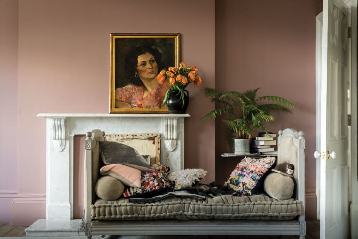
A room painted in Farrow & Ball’s “Sulking Room Pink.” Credit: Courtesy of Farrow & Ball
The prestigious British brand, founded in 1946, has had its paints splashed on countless high-profile walls, from New York’s Museum of Modern Art to Queen Elizabeth II’s weekend residence, Windsor Castle. Despite being headquartered in Dorset, on the UK’s south coast, Farrow & Ball’s rural operation has an undeniably cosmopolitan appeal.
It’s been used on the sets of acclaimed TV shows like Netflix’s “Sex Education” and has been name-dropped by celebrities from Padmia Laksmi to Shay Mitchell. In 2014, “Mad Men” star January Jones was photographed leaving a Farrow & Ball showroom in Los Angeles, her latest purchases looking more like designer handbags than one-gallon cans of paint.
The company has an annual turnover of over 100 million euros ($118 million). In May, Farrow & Ball was acquired by Danish coatings manufacturer Hempel for £500 million ($692 million), according to the Financial Times, though the firm would not confirm the reported sum.
So how did a gallon of unusually named paint become the ultimate aspirational statement?

January Jones buys paint from Farrow & Ball in Los Angeles in 2014. Credit: WENN/Alamy
A lesson in art history
In the aftermath of World War II, the West was upended by a do-it-yourself boom. IKEA was founded in 1943, with its first flat-pack furniture catalog released just a few years later. By 1954, Time magazine had dedicated its August cover story to the phenomenon, declaring DIY “the new billion-dollar hobby.”
Color dominated the decade. Gaudy, primary hues were all the rage, but traditional linseed oil paints failed to deliver the desired vibrancy. As a result, the paint industry began moving towards materials made from petroleum and acrylic resins, which were inexpensive to manufacture and encapsulated the bold, post-war optimism that had infiltrated interior design.
Farrow & Ball, however, steered clear of acrylics, sticking instead to simple linseed oil, which was purified and mixed with powdered pigment. In acrylic paints, solvents are added to ensure the finish is fast-drying and more durable, but at the price of toxic chemicals. Farrow & Ball’s method was solvent-free, and remained unchanged until 2009, when the company switched to a water-based recipe.
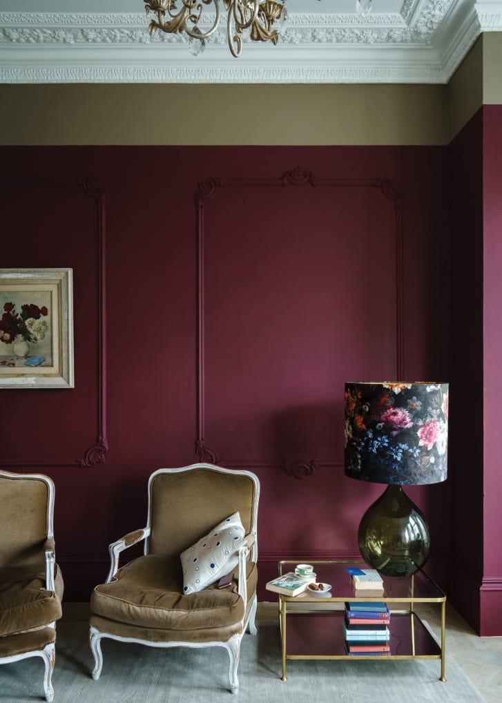
Farrow & Ball’s “Preference Red.” Credit: Courtesy of Farrow & Ball
“They pioneered the ‘chalky’ matte look for walls and a soft eggshell look on woodwork (that) is less ‘plastic’-looking and shiny than modern paints,” said Victoria Wormsley, an interior designer and owner of London-based French-Brook Interiors, in an email interview.
But it wasn’t until the 1990s that Farrow & Ball achieved the commercial success it enjoys today. The Dorset paint firm got its big break in 1992 when Tom Helme, an interiors advisor to the National Trust — a not-for-profit organization that conserves historic buildings and beauty spots across Britain — took control of Farrow & Ball with corporate financier Martin Ephson.
Farrow & Ball began working on cultural heritage projects, providing the National Trust with colors that were “sympathetic” to period decor rather than historically accurate. From grandiose stately homes to picturesque cottages, premium estates up and down the UK were restored to their former glory with a fresh lick of carefully curated Farrow & Ball paint. Once the perfect hue had been created for a property, it was canned and sold as part of the brand’s Heritage range. “Picture Gallery Red,” for instance, was first developed to redecorate the picture gallery at Attingham Park in Shropshire, England.
“Farrow & Ball are seen as the original designer paint,” Wormsley said. “They were one of the first companies in the UK to market paint as an aspirational product by connecting it to Britain’s wonderful architectural heritage.”
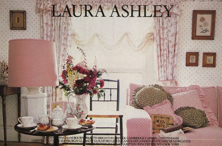
A 1980s magazine advert for Welsh period interior brand Laura Ashley. Credit: Alamy
Florid decor had dominated the 1980s, and fanfare for fuss and frills continued well into the 1990s. Busy damask wallpaper, elaborate chintz upholstery and gilded baroque styling regularly fronted the covers of magazines like Architectural Digest and World of Interiors — the more antiquated-looking the better. It was the ideal consumer landscape for a brand like Farrow & Ball, which built its image around the opulent iconography of British stately homes.
Amid growing pressure to embrace advanced manufacturing technology — Australian paint maker Dulux’s production, for instance, has been fully automated since 2017 — Farrow & Ball’s factory operation still relies on human involvement at every step. Pigments are hand-poured, then each batch is swatched and meticulously inspected by a Farrow & Ball chemist. This craftsmanship may partly account for the brand’s designer status — and explain its extravagant price tags.
The paint was positioned as luxury by association: If it was good enough for the lovingly maintained mansions of yesteryear, it was good enough for everyone (providing, of course, that you could foot the bill).
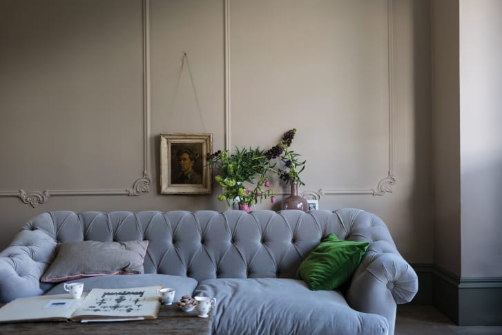
Farrow & Ball’s “Jitney,” pictured here, was named after a bus from New York to the Hamptons. Credit: Courtesy of Farrow & Ball
Country club cachet
Farrow & Ball has become ubiquitous in well-to-do neighborhoods (the brand has 61 showrooms across the US and Europe and over 220 stockists in London and Manhattan alone) while still making customers feel as if they are part of an exclusive coterie.
“It’s the sort of stuff that is discussed over dinner party tables,” said interior designer Sophie Richardson in “Inside the Posh Paint Factory,” a documentary about the company’s operations. “And I think if you can say you’ve got Farrow & Ball it means you’re in with the cool club.”
But not everyone sees Farrow & Ball as the epitome of luxury. The prestigious paint manufacturer even found itself on an infamous tongue-in-cheek list, created by high-society interior designer Nicky Haslam, detailing the world’s most unbearably “common” ( a snobbish British term for something that is unrefined or unsophisticated) things. Haslam confidently, if not arbitrarily, placed Farrow & Ball among entries including self-pity, ATMs, swans and hedge funds.
Nonetheless, Farrow & Ball has a loyal customer base. One of the Facebook groups dedicated to the paint brand boasts 55,000 members and is used to share application tips, color advice and proud photos of users’ own handiwork.
The peculiar shade names help foster a sense of community, said Wormsley, helping to create a sense of being in-the-know. “I think (the eccentric color names) gives Farrow & Ball customers a sense of being cognoscenti,” she added, “as the colours can’t be picked from the names.”
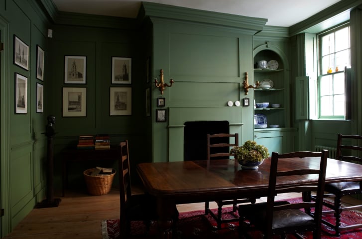
“Calke Green,” pictured here, was an original color created to restore Calke Abbey in Derbyshire, England. Credit: Courtesy of Farrow & Ball
Joa Studholme, a color curator at Farrow & Ball for the last 25 years, agreed that the shade names are “very, very, very important.”
“People form an attachment with a color and the stories they tell you,” she said in a phone interview. Take “Sulking Room Pink,” a dusty rose color intended to evoke the sultry glamour of European bedrooms. “When we made it everyone was like, why is it called that?” Studholme said. “And it’s such a simple reason.”
“Sulking Room Pink” was inspired by the French “boudoir,” which literally translates “to sulk.”
“It was so intriguing,” Studholme said, “And it builds affection. I think that’s the main thing.”
The quirky names are talking points, too, said Studholme. Colors such as “Slipper Satin” or “Stiffkey Blue” (be warned: the correct pronunciation is “stook-y blue”) are memorable precisely for their tricky pronunciation. “Although I don’t think we would deliberately go out and find a difficult word.”
While other period-inspired British brands have fallen by the wayside — last year, heritage textile and furniture label Laura Ashley was forced to close all 155 UK stores amid declining sales — Farrow & Ball has consistently managed to capture the aspirational imagination of the middle classes.
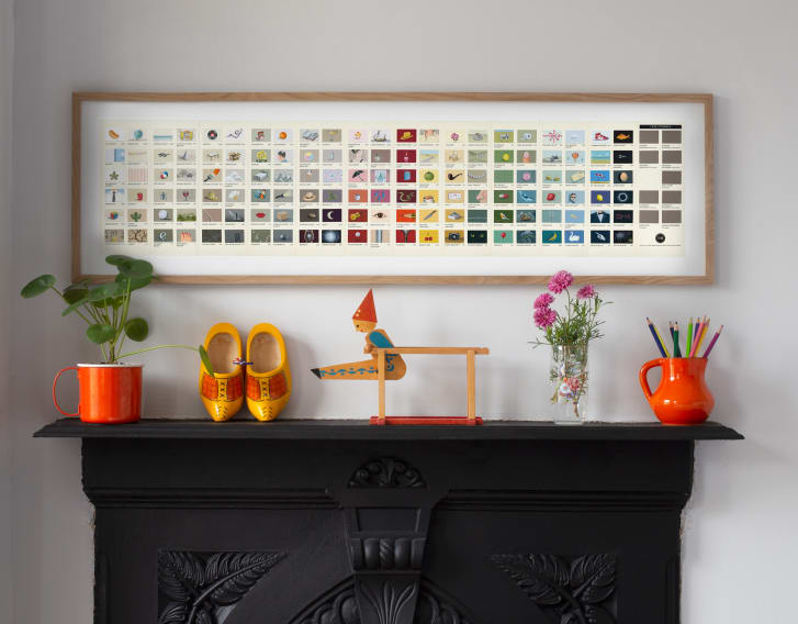
Rachel Spelling began customizing the Farrow & Ball color chart during the UK lockdown. Credit: Rachel Spelling
“All of its marketing photography is done in the most beautiful homes,” said Richardson. “Georgian houses with shutters and cornicing and high ceilings and all kinds of architectural detail and yet, ordinary people in ordinary houses have been really inspired by their look.”
Mural artist Rachel Spelling has even elevated the standard company color chart into highly sought-after wall art. Spelling’s customized version of the Farrow & Ball brochure retails for £150 ($207).
But as well as capitalizing on its cultural cachet the brand is also developing a sense of humor to offset its reputation as the market’s poshest paint. The seemingly self-aware Farrow & Ball now embraces jokes made at its expense, as demonstrated in the company’s first ever TV commercials, first aired in 2020, in which neurotic decorators go to extreme lengths to protect their expensive and delicate paint work.
In response to the Saturday Night Live sketch, the paint manufacturers took out an ad in the New York Times unveiling a special edition col-ouuuur, “English Roast No.30.”
“A rich and good hum-oured hue with subtle hints of bone-dry satire and a lingering aftertaste of charred British beef,” read the description. “It’s not just paint, it’s Farrow & Ball.”
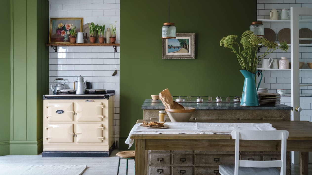
Top image: A kitchen painted in the Farrow & Ball shade “Bancha,” named after Japanese tea leaves.
AUTHOR: Leah Dolan
DATE PUBLISHED: 24th September 2021
SOURCE: Cnn.com
PHOTO CREDIT: CNN.Com
DATE PUBLISHED: 24th September 2021
SOURCE: Cnn.com
PHOTO CREDIT: CNN.Com


